FAT TUI SOAP STUDio
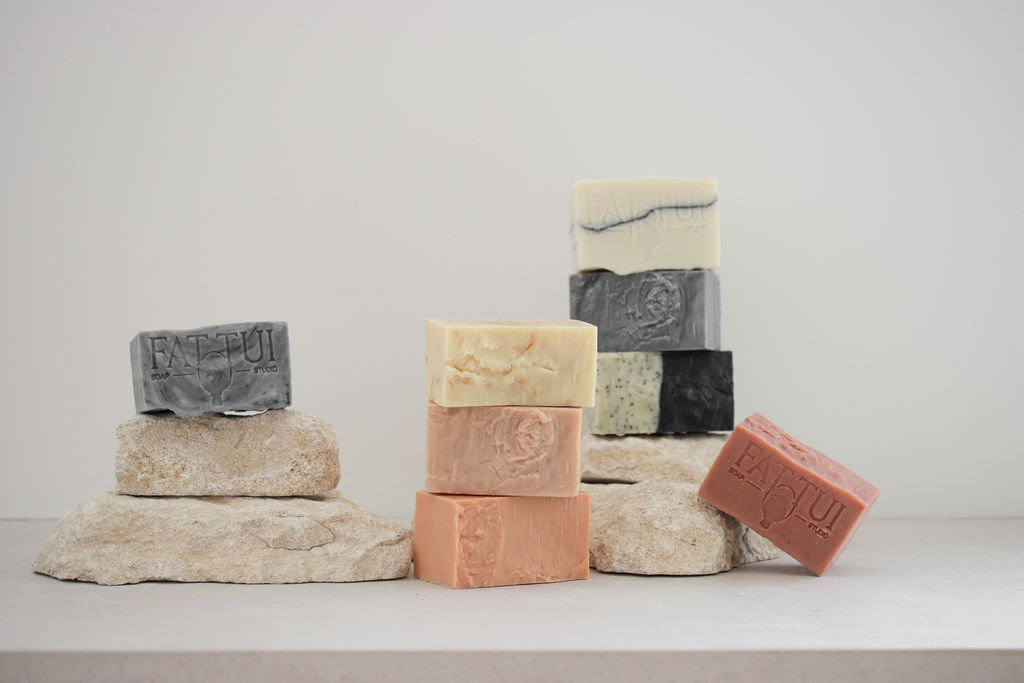
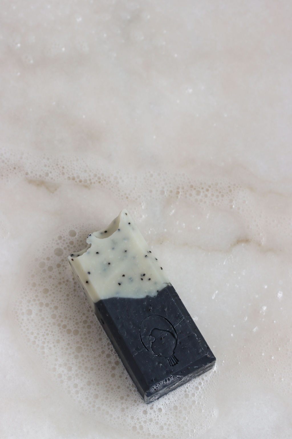
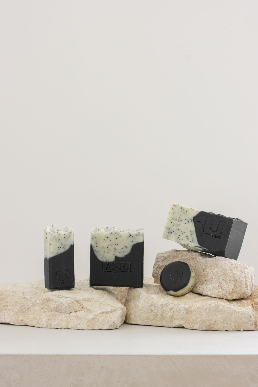
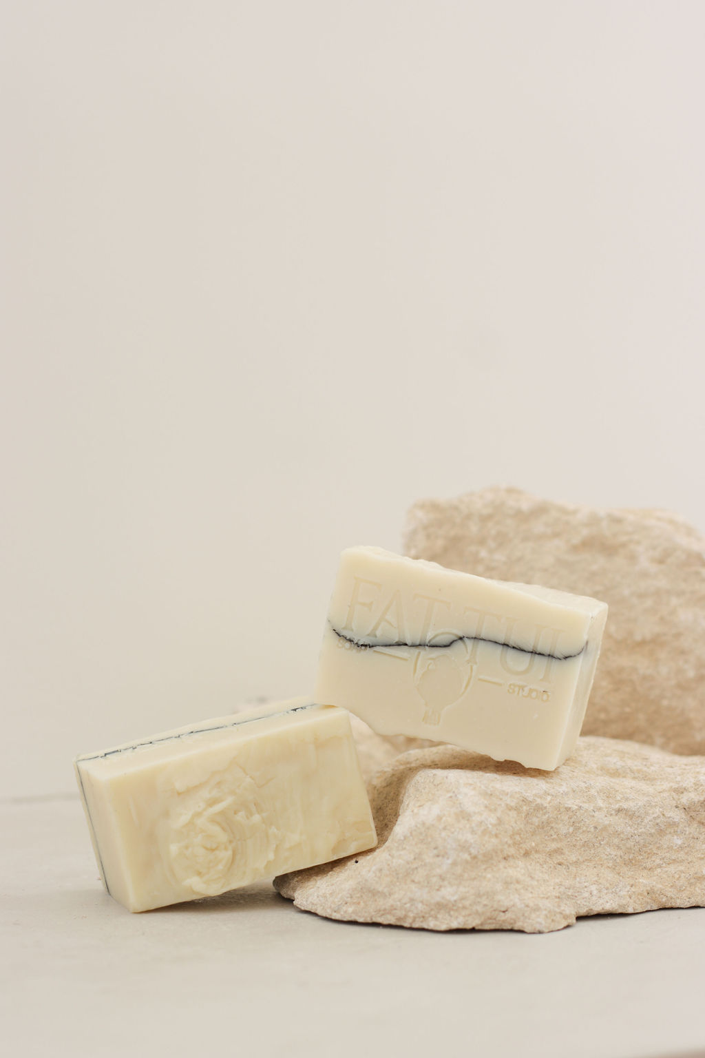
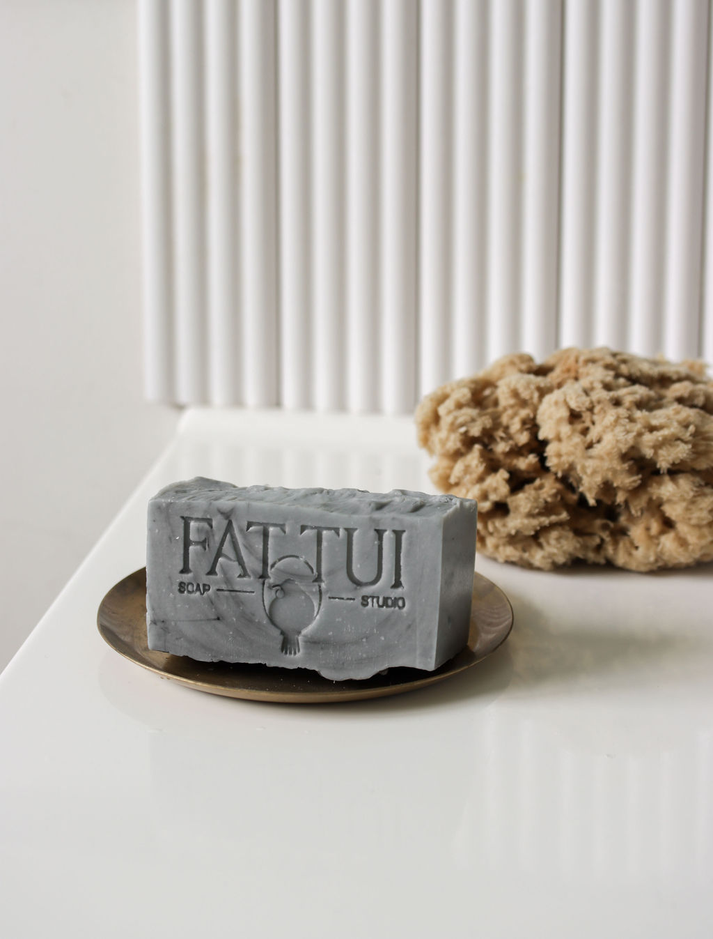
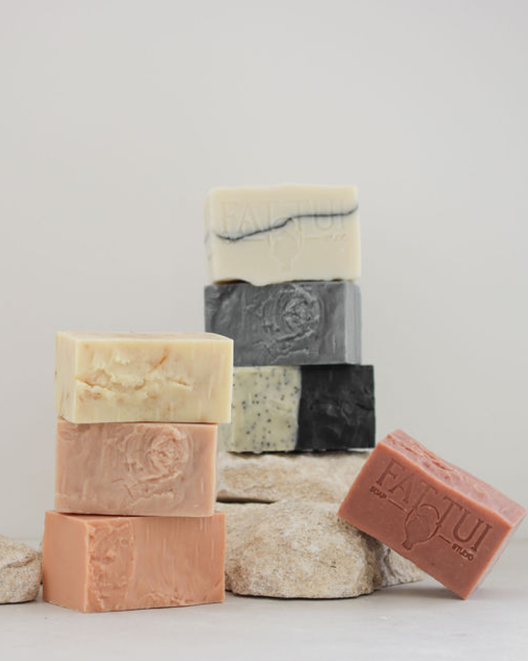
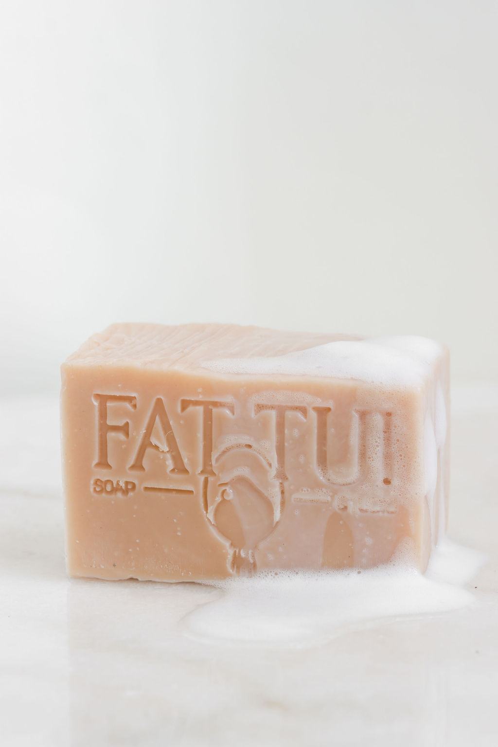
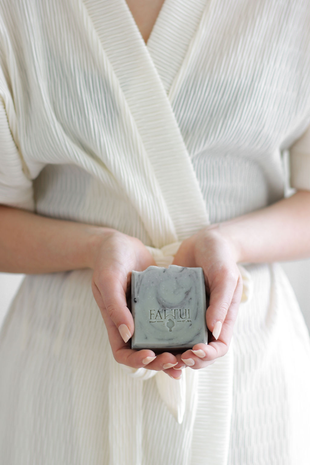
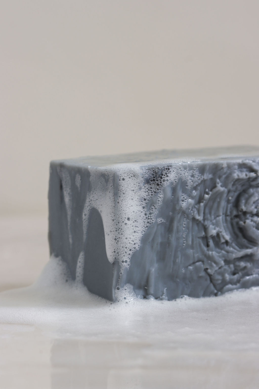
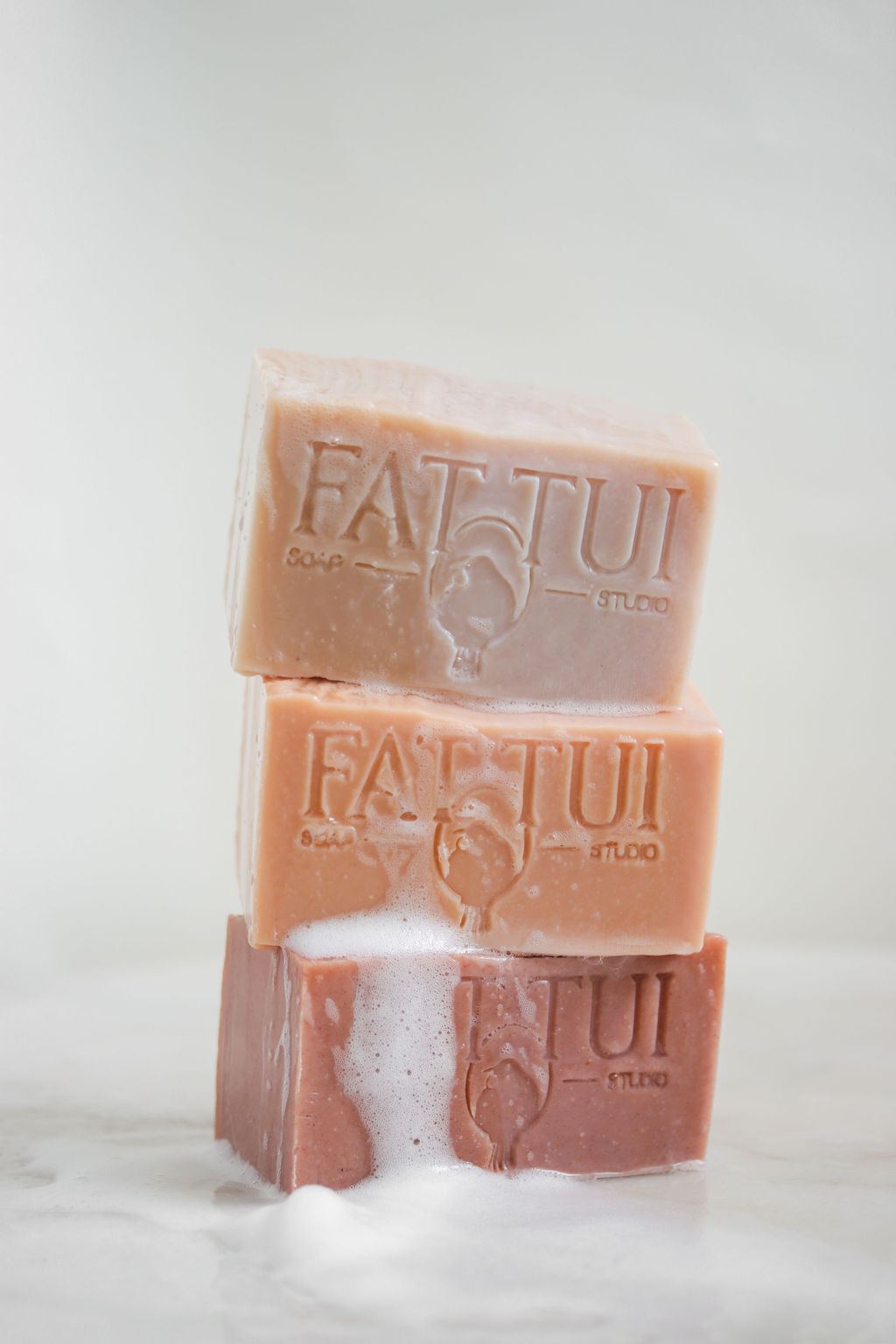
Fat Tui is a handmade soap brand that blends old-world care with modern intention. Every bar is crafted to feel premium and trustworthy; a product you can rely on, made with ingredients that are chosen for a reason.
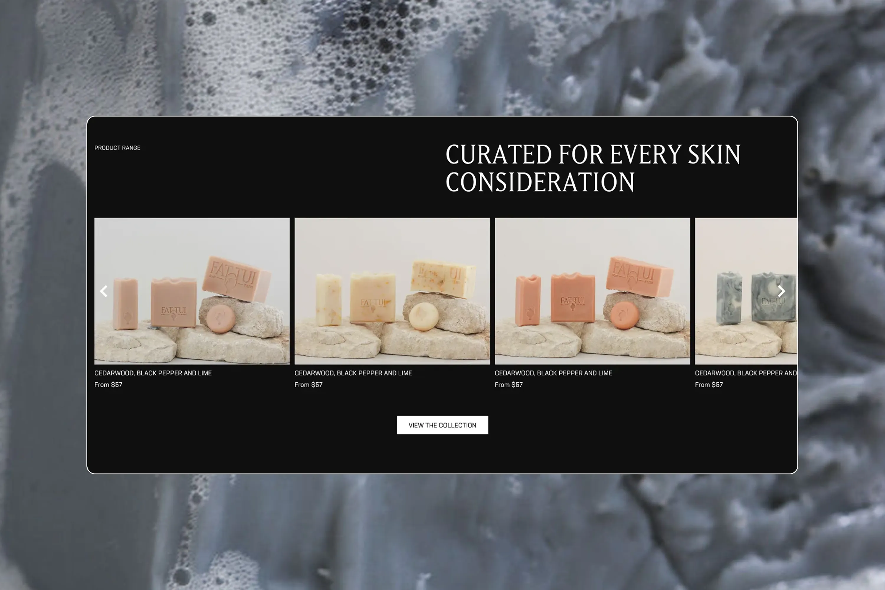
Ecommerce Website
Shopify

Fat Tui needed to stand apart by championing substance over hype, focusing on timeless quality and craftsmanship. The goal was to create a brand that feels grounded and gender-neutral, conveying confidence without pretence.
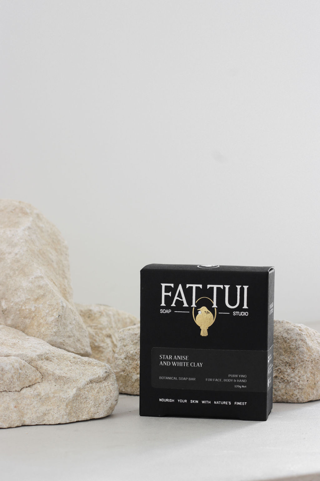
The brand mark features a content Tui bird, perched on a circular branch. This simple, grounded image nods to nature and the care that goes into each bar. The circle shape recalls a signet or stamp, reinforcing the idea of heritage and quality. The overall feel is calm, confident, and clean; echoing the brand’s commitment to effective, nature-based skincare that anyone can use.
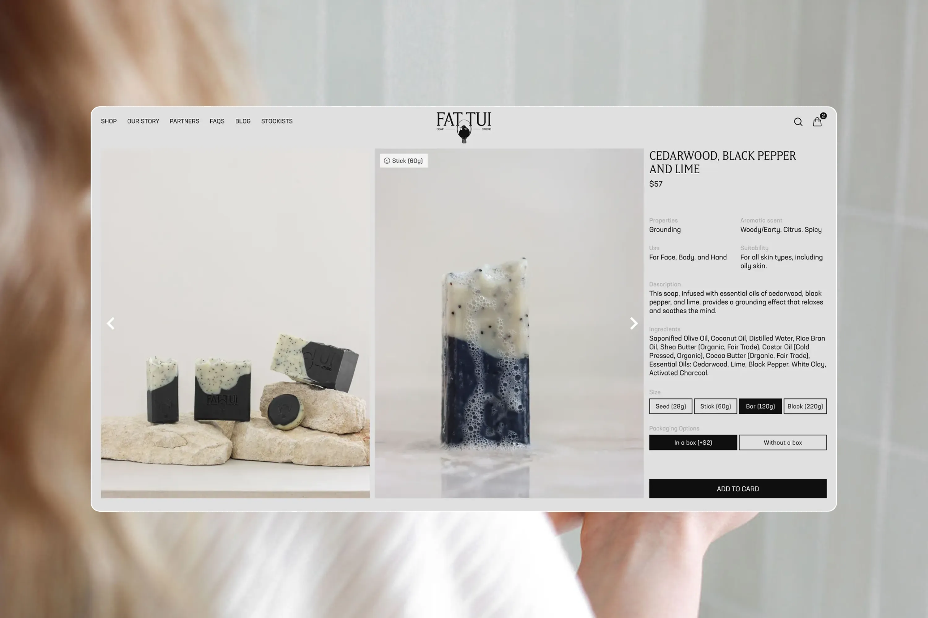

The packaging reflects the same level of care as the product inside. A custom dieline creates a distinct silhouette on shelf, while subtle foil details signal quality without shouting. Tamper-proof closures are cleverly integrated to balance functionality with a clean, minimal design. The result is packaging that feels thoughtful, elevated, and ready for both boutique shelves and modern bathrooms.