Nothing Naughty
A cohesive system for family of brands and products.
Nothing Naughty began as a manufacturer producing bars and health foods for other brands before developing its own product line. As the business grew and acquired new brands, its identity became increasingly fragmented. The team needed a cohesive brand system that could unite everything under one recognisable and trusted name.
Bringing order to a fragmented range.
With a growing portfolio of brands and products, all good for you, but none with strong individual recognition, the challenge was to bring them together under one powerful identity.
Nothing Naughty needed a brand that could create instant cohesion and trust, giving clarity to consumers and confidence to retailers.
The goal was to simplify without losing charm, uniting diverse products into a single, memorable brand that could grow its presence across multiple categories.
Simple, playful, and proud to be good for you.
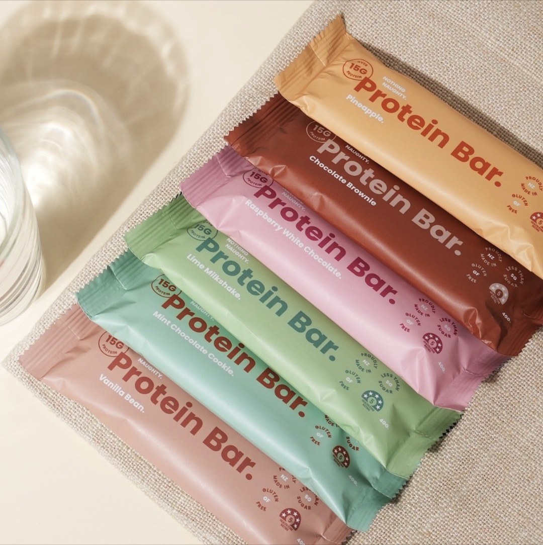
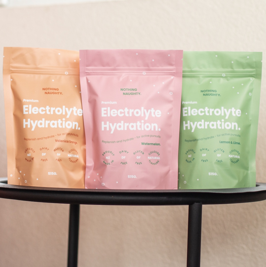
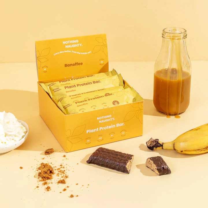
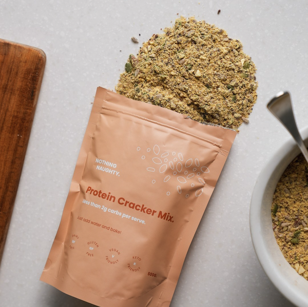
We rebuilt the brand from the ground up, creating a bold and cohesive identity that ties every product together under one confident system. Vibrant colour palettes and loose line illustrations communicate transparency and simplicity, reinforcing that there’s truly nothing naughty hidden inside.
The new design system extends across packaging, marketing, and digital touchpoints, creating a clear sense of consistency and personality across the full range.
Retailer range and acquisition.
The refreshed brand gave Nothing Naughty the credibility and cohesion to compete on a national stage. It now stands proudly on supermarket shelves and in gym bags across the country, representing a new era of clarity and growth.
The rebrand helped drive significant expansion and ultimately paved the way for their successful acquisition by Sportsfuel.